In my semester at the Queensland College of Art at the Griffith University in Brisbane, Australia I created the story of a micro nation on a floating island called Esperia and designed its corporate identity.
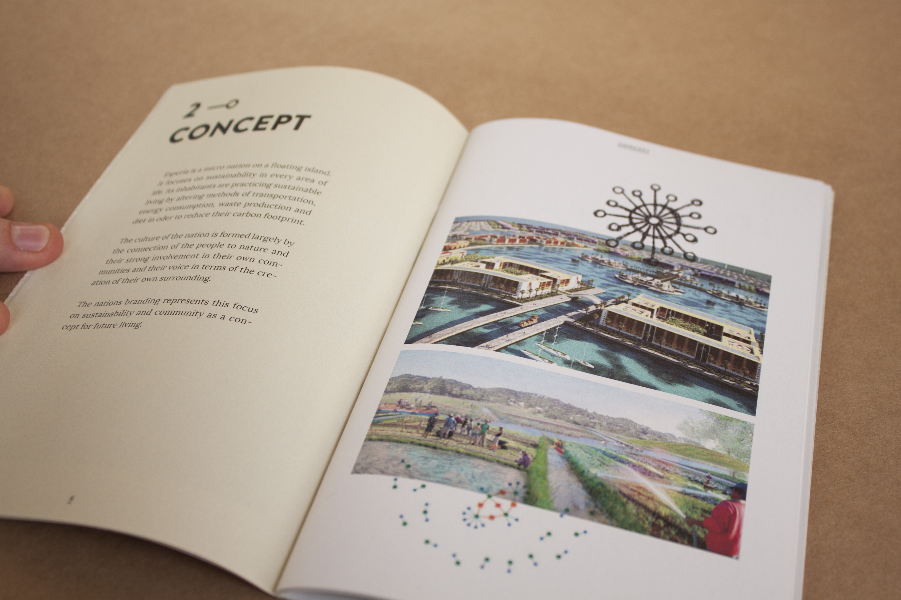
Esperia is a micro nation on a floating island. It focuses on sustainability in every area of life. Its inhabitants are practicing sustainable living by altering methods of transportation, energy consumption, waste production and diet in oder to reduce their carbon footprint.
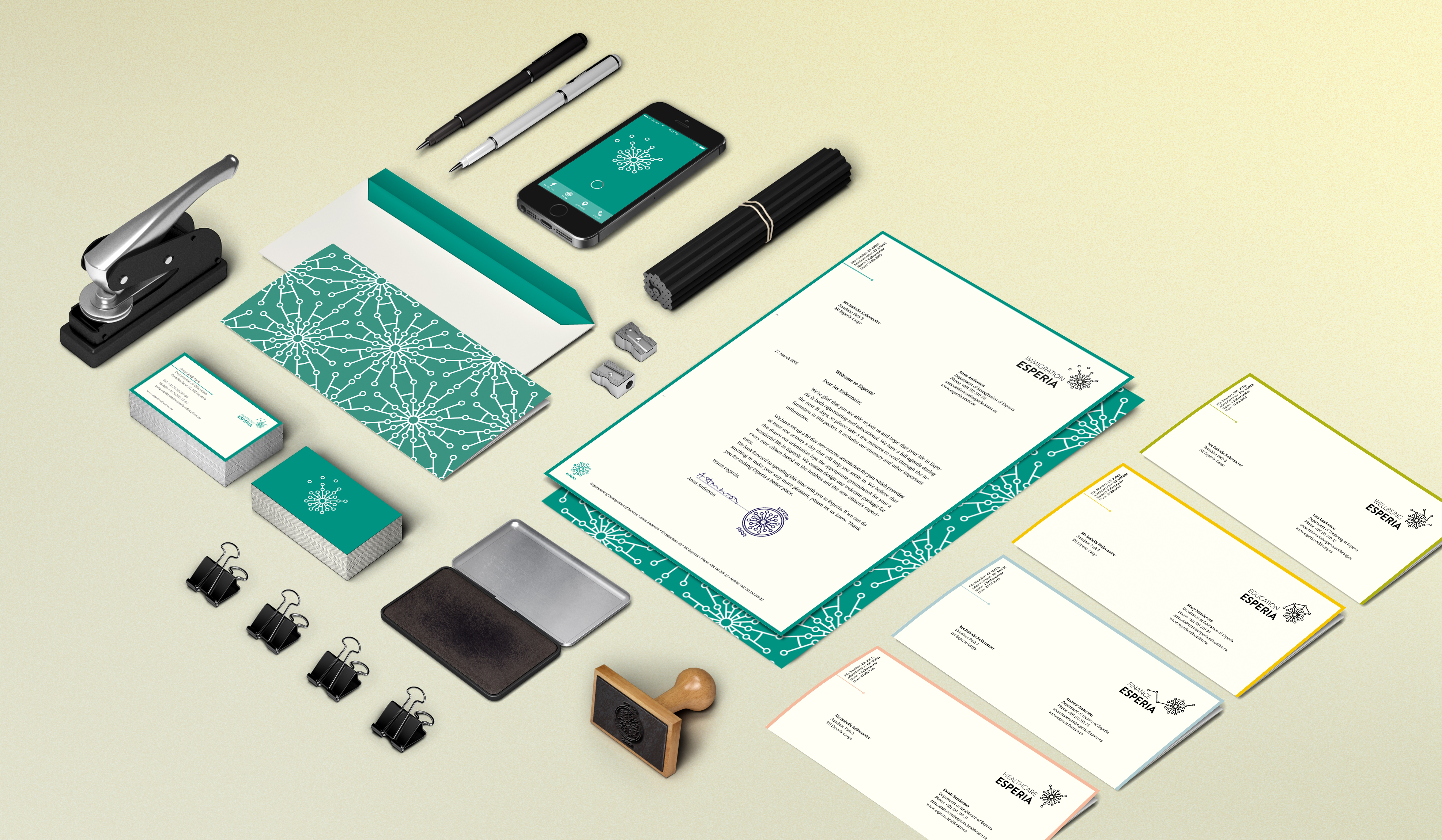
The culture of the nation is formed largely by the connection of the people to nature and their strong involvement in their own communities and the creation of their own surrounding. The nations branding represents this focus on sustainability and community as a concept for future living.
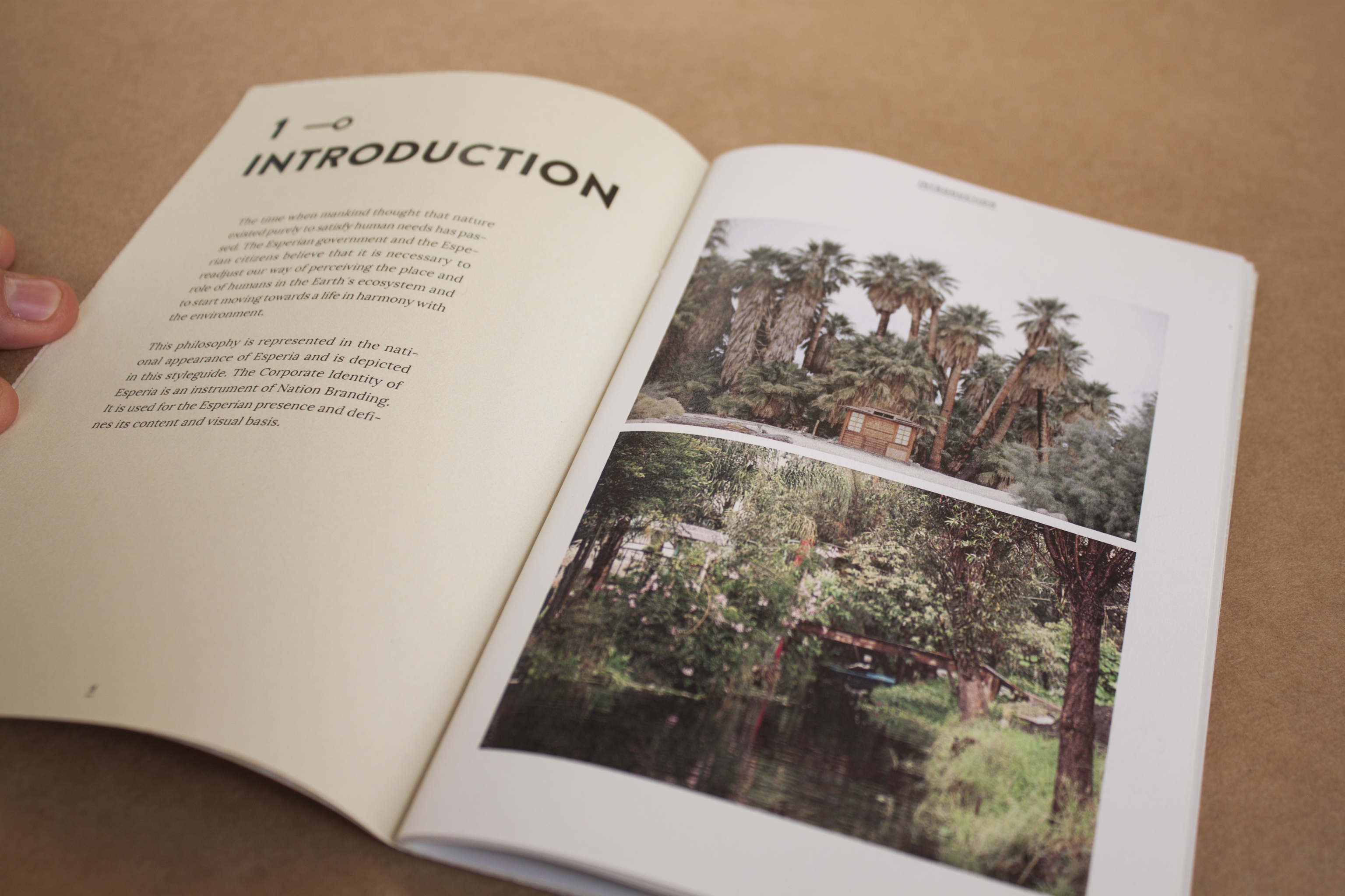
The time when mankind thought that nature existed purely to satisfy human needs has passed. The Esperian government and the Esperian citizens believe that it is necessary to readjust our way of perceiving the place and role of humans in the Earth’s ecosystem and to start moving towards a life in harmony with the environment.
This philosophy is represented in the national appearance of Esperia and is depicted in this styleguide. The corporate identity of Esperia is an instrument of nation branding. It is used for the Esperian presence and defines its content and visual basis.
One of my aims in designing this corporate identity was to avoid the cliché eco village style and show that ethical and ecological values can be expressed in a high quality design and straightforward visual language.
Einer meiner Kurse am Queensland College of Arts war die Branding Class, in der ich mich der Idee widmete, ein Nation Branding für eine autarke Mikronation auf einer schwimmenden Insel zu gestalten. Ich ließ mich bezüglich
Form und Aussehen sowohl von Konzepten futuristischer schwimmender Städte als auch den Chinampas, schwimmenden Landwirtschaftssystemen der Azteken, inspirieren.
Sie besteht aus länglichen Strukturen, die auf eine Mitte zulaufen, dazwischen kann sich mit Booten fortbewegt
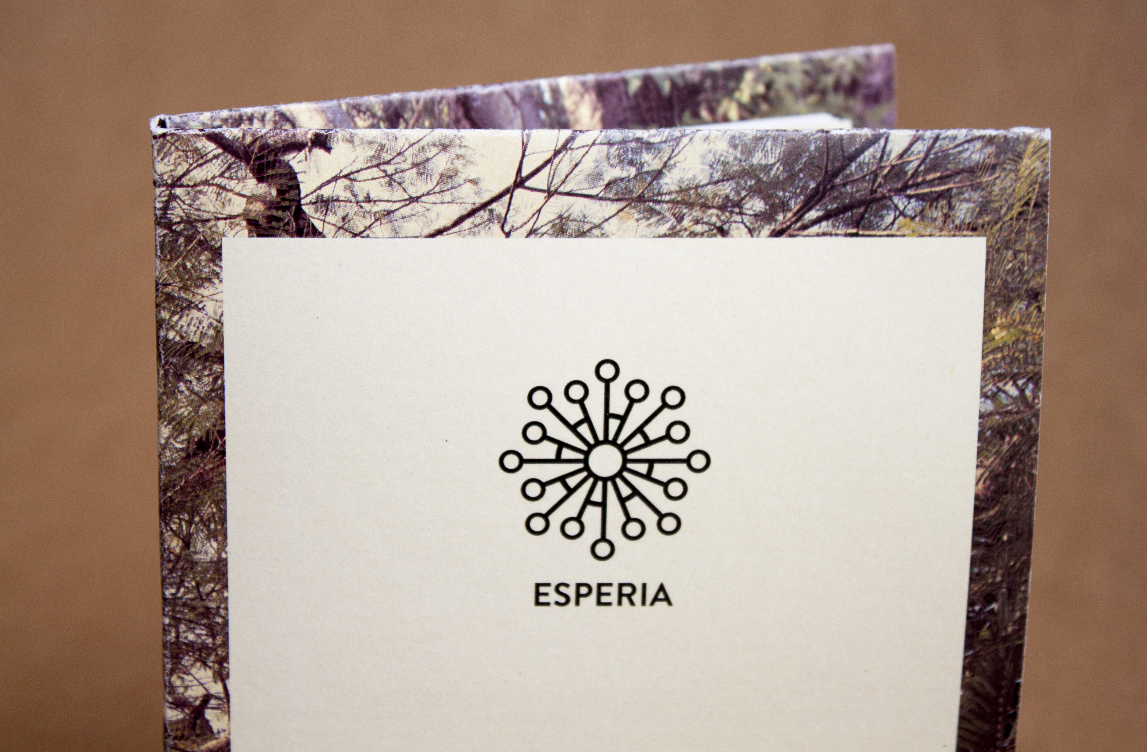
werden. Die Form der Insel wird auch im Logo widergespiegelt. Die kleinen Kreise repräsentieren die verschiedenen Gemeinschaften, aus denen die Mikronation besteht. Sie alle haben eine Verbindung zu dem großen Kreis, dem Zentrum. Dieser kann als Symbol für die Erde, den Ursprung stehen und der zweite, angedeutete Ring darum deutet deren Zusammengehörigkeit an.
Der Kreis als wiederkehrendes Element soll außerdem die Ansätze einer holistische Philosophie des Landes, sowie das Wirtschaften nach dem Vorbild von Stoffkreisläufen der Natur. Ein Hauptanliegen bei der Gestaltung des Erscheinungsbildes war, eine klischeehafte Öko-Anmutung zu vermeiden und einen nachhaltigen Lebensstil grafisch attraktiv darzustellen.